


Cookies help us deliver our services. By using our services, you agree to our use of cookies.
- Register
- Log in
-
Shopping cart
(0)
You have no items in your shopping cart.
Search
FIRST Components Academy | How to Select the Ideal TouchGFX Object for GUI Builder Use
Wednesday, August 13, 2025
From Winstar News of August '25
How to Select the Ideal TouchGFX Object for GUI Builder Use
TouchGFX is a graphical user interface (GUI) development framework provided by STMicroelectronics, designed for embedded system development targeting STM32 microcontrollers (MCUs). It offers the capability to design object-oriented displays, assisting STM32 MCU users in constructing smooth, beautiful, and diverse UI pages.
The following example uses TouchGFX version 4.23.2 as a reference:
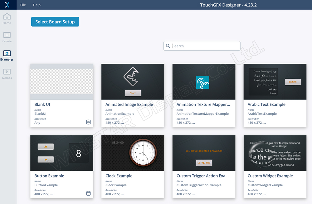
Figure 1: TouchGFX startup screen showing options like Example, Demo, Create Board Chip, etc.
Overview of TouchGFX Structure
The TouchGFX program architecture adopts the Model-View-Presenter (MVP) pattern, as illustrated in Figure 2, with the following advantages:
• Separation of Concerns: Code maintenance varies across different stages, facilitating users to write interfaces and communicate with lower layers, resulting in clear, understandable structures with high reusability.
• Unit Testing: The upper-layer view can directly interact with the code generated by GFX, making it easier to validate results independently.
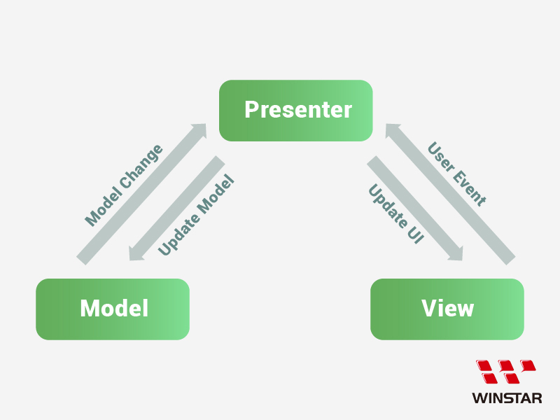
Figure 2: Relationship diagram of TouchGFX components (MVP)
• View: The main display page generated by GFX, responsible for interface representation. Typically, it acts as the passive end of the MVP's upper layer, handling all design information for the UI, and displays corresponding screens based on the properties of the used objects.
• Model: Serves as the core location for processing and sending data. Some communication packets are judged or processed and then sent to the View via the Presenter to change the currently displayed content and object status.
• Presenter: Acts as the communication channel between View and Model, allowing data requests from the Model so that functions can be reused.
Due to the firmware design philosophy, which emphasizes the Model as the command processing hub, a diagram can be illustrated (Figure 3).
Through lower-level processing for different interfaces (e.g., CAN bus, RS485, UART, Bluetooth, Wi-Fi), data is forwarded to the Model for communication and then relayed to the View via the Presenter, achieving object status switching.
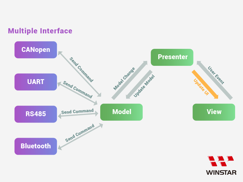
Figure 3: Communication between multiple interfaces and the MVP architecture
Two examples can illustrate the data exchange method:
Sample 1: Suppose the Host sends a CANopen command to the Device (Figure 4).
CANopen receives packets through the IF port, possibly decrypts the packet data through the CAN task, and then forwards the content to the Model. After the Model updates the database and executes the corresponding command, it sends the result back to the View via the Presenter to refresh the page.
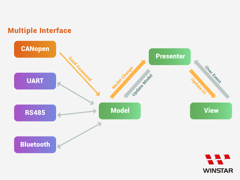
Figure 4: Example of Host sending a command
Sample 2: If a user touches a UI object on the device, a touch event packet is reported back to the Host (Figure 5).
When a user clicks on an interactive object, the View generates a click event, which is then passed to the Model via a User Event through the Presenter. The Model responds based on the currently used interface, sending the code back to the CAN task, and finally sends a TX packet to notify the Host.
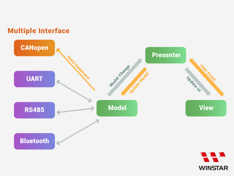
Figure 5: User touch event sent back to the Host
Overview of View Page Knowledge
In the TouchGFX software interface, designing N pages will generate N corresponding sets of View and Presenter, but only one Model will control all view pages.
When a user designs a UI scenario—including graphics, appearance, coordinates, and text display—pressing "Generate Code" will produce code in the corresponding named view page.
The generated folders are divided into ..\generated\ and ..\gui, where ..\generated\ contains the basic code for the designed page display, and ..\gui\ contains the logic for object interactions.
We can use this information to place objects onto their respective pages and refer to the usable code.
Here's a simple step-by-step explanation of the above description.
For example:
1. Open a blank project and press "Create New" to establish a Project (Figure 6).
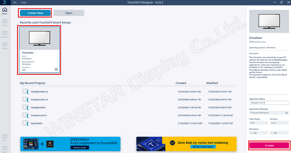
Figure 6: TouchGFX project opening screen
2. In TouchGFX, a default Screen1 will be available. We add a new button object, select the desired image, and execute "Generate Code" (Figure 7).
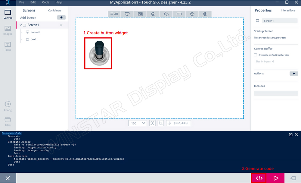
Figure 7: Create Button demonstration
3. Switching to the project path will show two new folders: gui and generated (Figure 8).
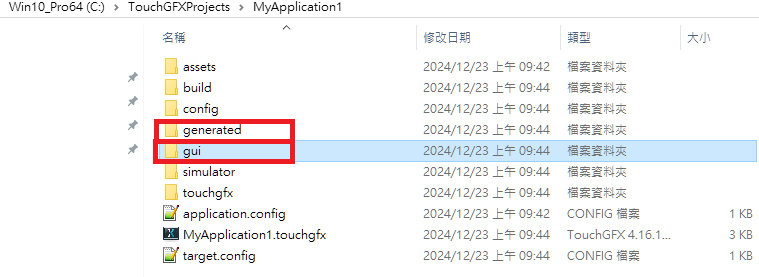
Figure 8: Project folder content
The generated folder contains the basic code related to Screen1 components, which is auto-generated by TouchGFX and cannot be modified directly. If the object state on the page changes and code is rebuilt, the code in the generated folder will update.
Similarly, after executing "Generate Code," GFX will create Screen1ViewBase.cpp in ..\generated\gui_generated\src\screen1_screen (Figure 9).
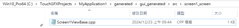
Figure 9: Location of Screen1ViewBase.cpp
If we open Screen1ViewBase.cpp with Notepad++ (Figure 10), we can see the properties and content related to the Screen1 page and button data:
• Set Button coordinates:
button1.setXY(63, 109);
• Set Button image ID:
button1.setBitmaps(TouchGfx::Bitmap(BITMAP_BUTTON_00_00_ID),
TouchGfx::Bitmap(BITMAP_BUTTON_00_00_ID));
• Add the button object to the page:
add(button1);
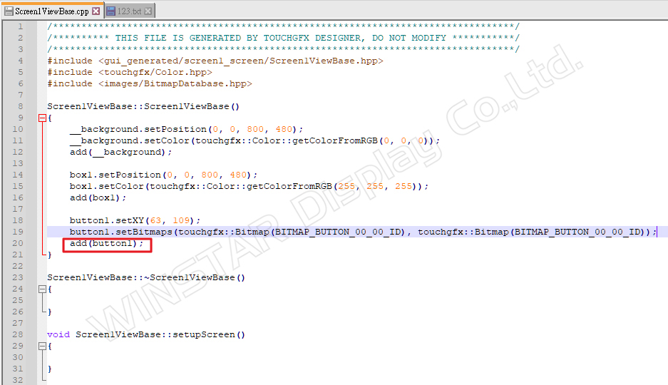
Figure 10: Content of Screen1ViewBase.cpp
The code with the XXXBase.cpp name will be rebuilt during "Generate Code," and any changes to the attribute data will be reflected. Thus, if we adjust the button’s position, image, etc., the functions may change as well.
As for the gui folder, it is where TouchGFX allows users to write program logic (Figure 8). Therefore, the MVP architecture is also constructed here (Figures 11 and 12), enabling us to plan our own MVP code communication methods to realize UI design directions.
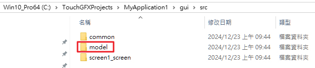
Figure 11: Path of the Model
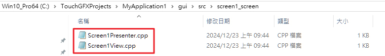
Figure 12: Paths of Presenter and View
4. Designing a Simple Scenario for GUI/Generated Design Explanation
• Write a logical control for interaction between a button and text.
• When the button is clicked once, the text value increases.
Here’s how to implement this functionality:
Step 1:
Drag two objects, a button (button1) and a text area (textArea1) (Figure 13).
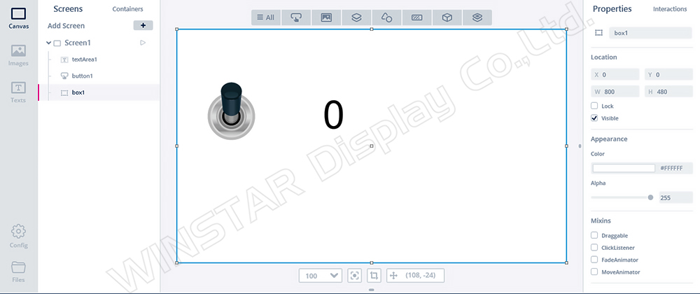
Figure 13: UI design project with Button control
Step 2:
Select the interaction action on the right side, add a Button click Event, and choose to call the function add_number when this action is executed (Figure 14).
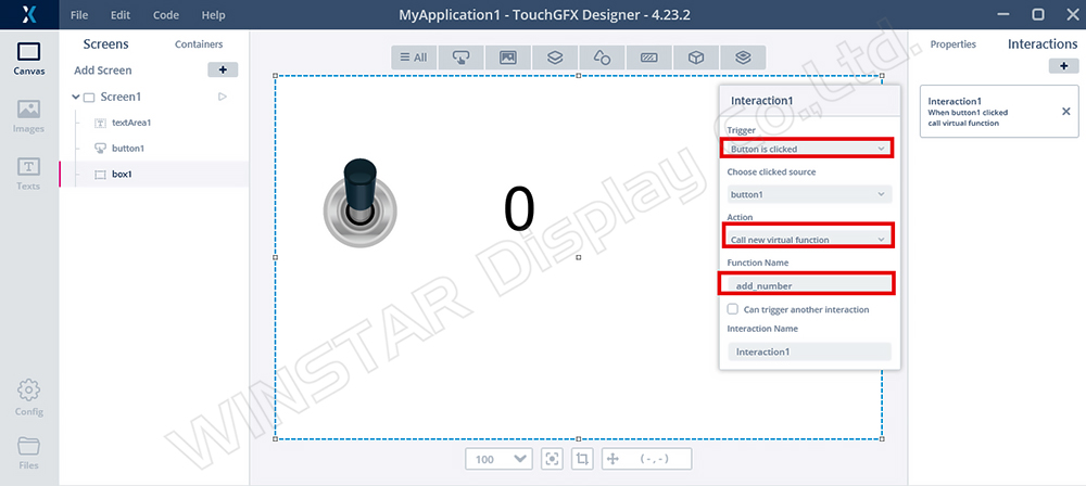
Figure 14: Adding Interaction1 Event
Step 3:
Observe Screen1ViewBase.cpp (Figure 15) to find the relevant property code for creating button1 and textArea1.
Due to the newly added interactions, buttonCallbackHandler is generated to handle the button1 touch event. When clicked, it will call the function named add_number via the callback function.
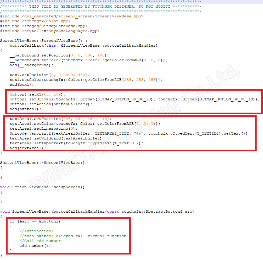
Figure 15: Screen1ViewBase.cpp
Content of Screen1ViewBase.hpp (Figure 16).
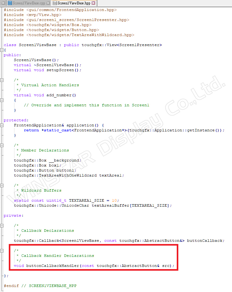
Figure 16: Content of Screen1ViewBase.hpp
Step 4:
In the gui section, add Screen1View.cpp and Screen1View.hpp.
Add the add_number function to utilize the count parameter for accumulation (Figures 17 and 18).
Use Unicode: snprintf(textArea1Buffer, TEXTAREA1_SIZE, "%02d", count); to refresh the updated count into textArea1.
Then use textArea1.invalidate() to refresh the data.
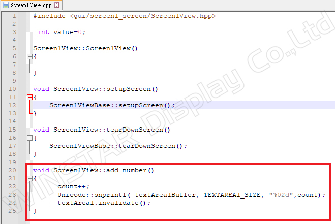
Figure 17: Content of Screen1View.cpp
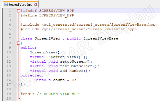
Figure 18: Content of Screen1View.hpp
After running the simulator, it can be confirmed that each time button1 is touched, textArea1 (count value) will start adding from 0 (Figure 19).
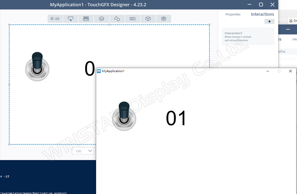
Figure 19: Simulator result display
This confirms that the definition of object properties is generally established in the generated path, while the user writes logic execution code under the gui section.
TouchGFX and Builder Object Property Examples
The Smart Display GUI Builder provided by Winstar is a drag-and-drop UI/UX design tool, offering customers a no-code development service tailored for rapid development and design of STM32 MCU-based products. Built as an extension of the TouchGFX framework, the GUI Builder incorporates the original widget functionalities of TouchGFX, with its primary distinction being the support for multiple system interfaces and communication protocols. This allows users to directly observe how commands affect widget control and changes.
Here is the introduction to the Builder:
https://www.youtube.com/watch?v=zL72k_qZrTc&t=1s
The design philosophy of SmartDisplay is related to the functionality of TouchGFX settings, including the firmware written using STM32 MCUs as the foundation of MVP. The objects inside are designed using existing items combined with logic.
Therefore, among the objects provided by the GUI Builder, some items can be implemented using existing TouchGFX UI components to achieve corresponding display results.
*Supplementary Explanation Segment
Here's a simple example using the Builder slider (Figure 20):
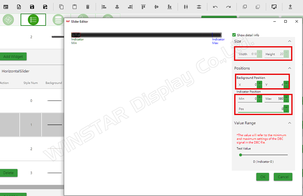
Figure 20: Builder slider property page
The properties of the Builder Slider are as follows:
• Size:
○ Width: 618
○ Height: 20
• Positions:
○ Background Position (X): 0
○ Background Position (Y): 4
• Indicator Position:
○ Min: 0
○ Max: 580
○ Pos: 0
These parameters correspond to the Slider Component settings in TouchGFX (Figure 21).
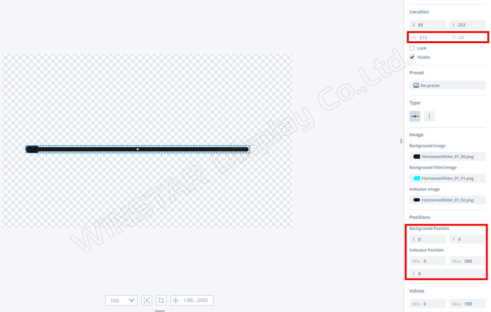
Figure 21: Properties of TouchGFX Slider
The properties of TouchGFX Slider are as follows:
• Location:
○ Width: 618
○ Height: 20
• Positions:
○ Background Position (X): 0
○ Background Position (Y): 4
• Indicator Position:
○ Min: 0
○ Max: 580
○ Y: 0
Users can adjust the Start value in GFX to replicate the results in Builder (Figure 22).
If the value is set to 100, it can replicate the same result in Builder (Figure 23).
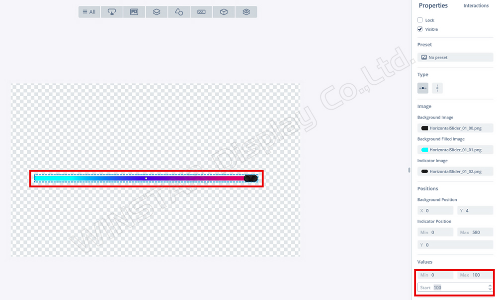
Figure 22: Adjusting Start = 100 in TouchGFX
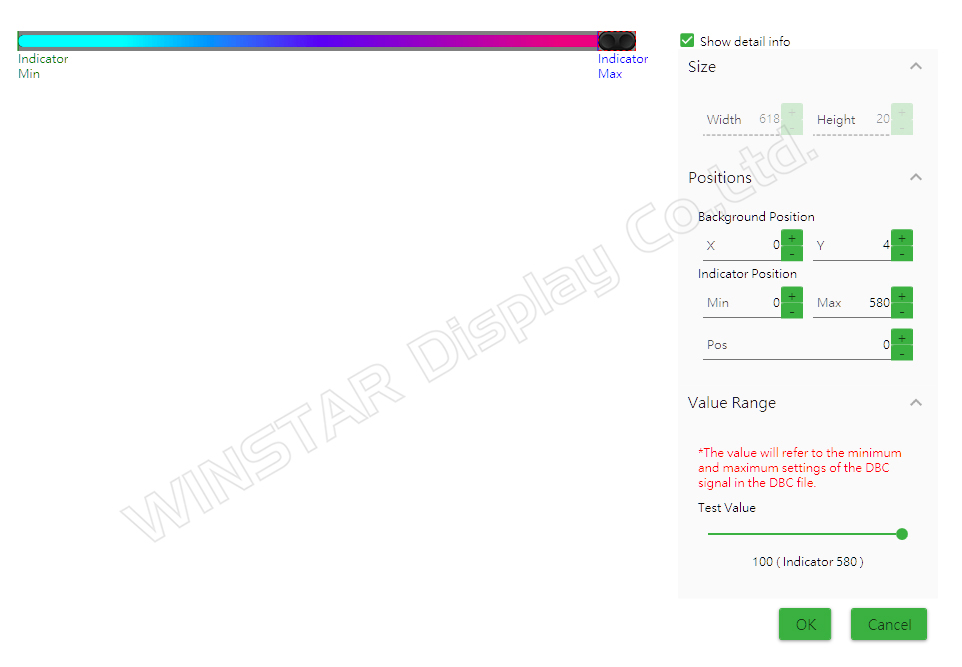
Figure 23: Adjusting Test Value = 100 in Builder
If we look at the Screen1ViewBase.cpp generated by GFX (Figure 24):
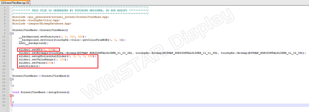
Figure 24: Function in Screen1ViewBase.cpp
We can understand how the parameters mentioned above can be used and modified in code. Such numbers are directly related to the design of the GFX project. When the Builder uploads the project and resets the initial parameters for the Device Slider.
If the Host sends a command to change the Slider's value, it will execute slider1.setValue() in the view to complete the object's change (Figure 25).
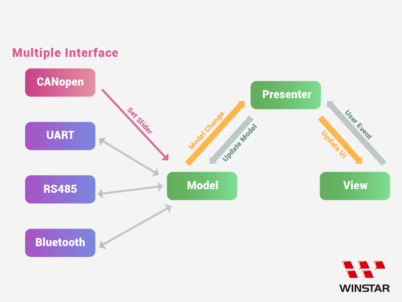
Figure 25: Host sends slider command
This is a simple explanation of the relationship between Builder and TouchGFX objects.
Future Extensions and Development Evaluation of Builder Objects
With the recent update to TouchGFX version 4.24.0, new objects and functionalities are available. If we need to evaluate whether Builder can be integrated, we can first try using the default examples from GFX for demos and research (Figure 26):
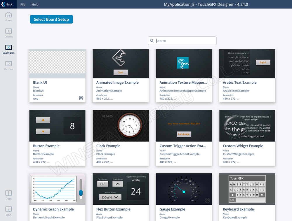
Figure 26: Various example projects
Since version 4.24.0 supports new objects like QR code, we can evaluate the parameters and functions that can be used if Builder is integrated.
Example Using QR Code:
1. Select BlankUI.
2. Drag in the QR code Container.
3. Observe the configurable properties (Figure 27):
• Location: (X, Y)
• Configuration:
○ QRVersion
○ Scale
○ Text
○ Error Correction Code…
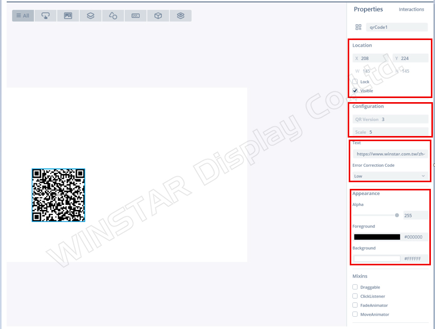
Figure 27: QR code property screen
These QR code parameters can be referenced from the official website (Figure 28).
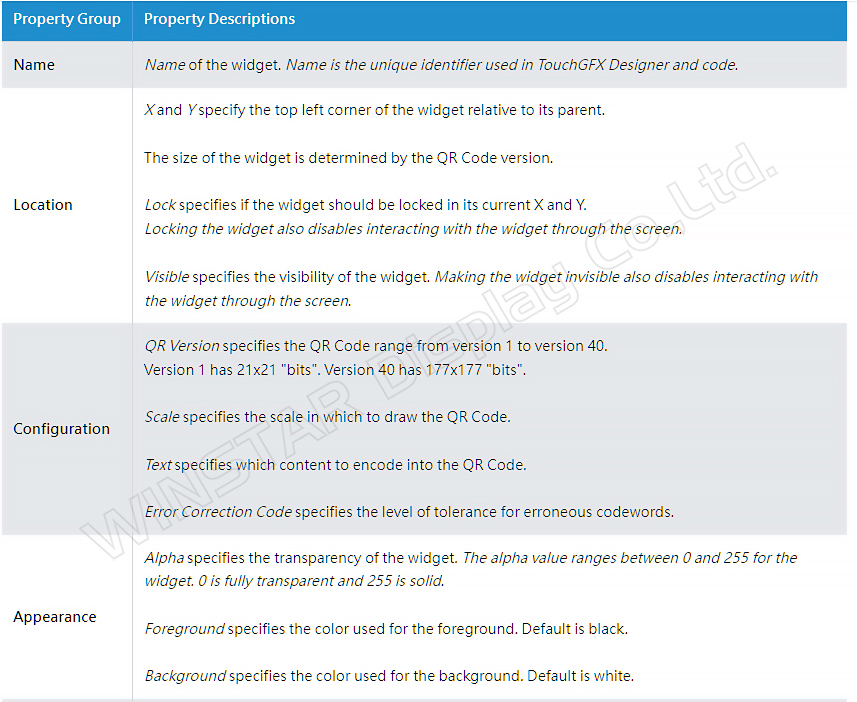
Figure 28: Official website explanation
In the generated function of Screen1ViewBase.cpp, confirm the available parameters and settings (Figure 29):
1. Set coordinates: qrCode1.setXY(208, 224);
2. Set QR code version: qrCode1.setQRCodeVersion(3);
3. Set QR scale: qrCode1.setScale(5);
4. Input text to generate the QR code:
qrCode1.convertStringToQRCode("https://www.winstar.com.tw/zh-tw/");
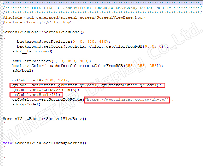
Figure 29: Generated code in Screen1ViewBase.cpp
If the QR code function is integrated into Builder in the future, it will allow users to set these adjustable parameters.
References
https://support.touchgfx.com/docs/category/introduction
https://www.eettaiwan.com/20200203np21/
https://en.wikipedia.org/wiki/STMicroelectronics